Insights for Stakeholders
Contents
Insights for Stakeholders#
Lesson Objectives#
By the end of this lesson, students will be able to:
Define the stakeholder and their business problem that will be the guiding framework for this week’s lessons.
Identify the target and features for a machine learning model to use for insights
Understand how different feature/target choices can provide a different spin/perspective on the problem.
The Stakeholder#
We’ve been hired by a school district that wants to use data science to identify and support high school students at risk of poor performance.
They have provided us with data on several hundred of their former students and want to identify students who are at risk of poor grades/performance by year 3.
The school included 3 years of grades(presumable grades 10-12), which are labeled as (G1-G3).
They sent us an excel file with 3 sheets:
student-mat: grades for Math (the student-mat sheet)
student-por: grades for Portuguese
README: data dictionary
The goal is to identify these students and provide additional support/tutoring to improve their academic performance.
Our Task#
Develop machine-learning models to predict student performance in their final year (year 3).
We will then use our model(s) to extract insights into which students are most at-risk for poor performance.
We will provide a summary of our findings and 3 recommendations to the school on how to best identify these at-risk students.
We will be focusing on the Math grades to start.
Stakeholder Considerations#
Before diving into modeling, let’s examine the data the school district has provided us and let’s brainstorm/discuss our approach for our models.
EDA#
import pandas as pd
import numpy as np
import matplotlib as mpl
import matplotlib.pyplot as plt
import seaborn as sns

## Customization Options
# pd.set_option("display.max_columns",100)
plt.style.use(['seaborn-talk'])
mpl.rcParams['figure.facecolor']='white'
# import dataframe_image as dfi
# url = "https://docs.google.com/spreadsheets/d/e/2PACX-1vS4sHmGyjSFri2HksxLxhLyFaBrewkuzVXvmhEMalxNxEQPZMVUxVkkOMgpCNFGdYJV0L-2bW59aM_M/pub?output=csv"
url = "https://docs.google.com/spreadsheets/d/e/2PACX-1vS6xDKNpWkBBdhZSqepy48bXo55QnRv1Xy6tXTKYzZLMPjZozMfYhHQjAcC8uj9hQ/pub?output=xlsx"

df = pd.read_excel(url,sheet_name='student-mat')
df.info()
df.head()
<class 'pandas.core.frame.DataFrame'>
RangeIndex: 395 entries, 0 to 394
Data columns (total 33 columns):
 #   Column      Non-Null Count  Dtype
---  ------      --------------  -----
 0   school      395 non-null    object
 1   sex         395 non-null    object
 2   age         395 non-null    float64
 3   address     395 non-null    object
 4   famsize     395 non-null    object
 5   Pstatus     395 non-null    object
 6   Medu        395 non-null    float64
 7   Fedu        395 non-null    float64
 8   Mjob        395 non-null    object
 9   Fjob        395 non-null    object
 10  reason      395 non-null    object
 11  guardian    395 non-null    object
 12  traveltime  395 non-null    float64
 13  studytime   395 non-null    float64
 14  failures    395 non-null    float64
 15  schoolsup   395 non-null    object
 16  famsup      395 non-null    object
 17  paid        395 non-null    object
 18  activities  395 non-null    object
 19  nursery     395 non-null    object
 20  higher      395 non-null    object
 21  internet    395 non-null    object
 22  romantic    395 non-null    object
 23  famrel      395 non-null    float64
 24  freetime    395 non-null    float64
 25  goout       395 non-null    float64
 26  Dalc        395 non-null    float64
 27  Walc        395 non-null    float64
 28  health      395 non-null    float64
 29  absences    395 non-null    float64
 30  G1          395 non-null    float64
 31  G2          395 non-null    float64
 32  G3          395 non-null    float64
dtypes: float64(16), object(17)
memory usage: 102.0+ KB
| school | sex | age | address | famsize | Pstatus | Medu | Fedu | Mjob | Fjob | ... | famrel | freetime | goout | Dalc | Walc | health | absences | G1 | G2 | G3 | |
|---|---|---|---|---|---|---|---|---|---|---|---|---|---|---|---|---|---|---|---|---|---|
| 0 | GP | F | 18.0 | U | GT3 | A | 4.0 | 4.0 | at_home | teacher | ... | 4.0 | 3.0 | 4.0 | 1.0 | 1.0 | 3.0 | 6.0 | 5.0 | 6.0 | 6.0 |
| 1 | GP | F | 17.0 | U | GT3 | T | 1.0 | 1.0 | at_home | other | ... | 5.0 | 3.0 | 3.0 | 1.0 | 1.0 | 3.0 | 4.0 | 5.0 | 5.0 | 6.0 |
| 2 | GP | F | 15.0 | U | LE3 | T | 1.0 | 1.0 | at_home | other | ... | 4.0 | 3.0 | 2.0 | 2.0 | 3.0 | 3.0 | 10.0 | 7.0 | 8.0 | 10.0 |
| 3 | GP | F | 15.0 | U | GT3 | T | 4.0 | 2.0 | health | services | ... | 3.0 | 2.0 | 2.0 | 1.0 | 1.0 | 5.0 | 2.0 | 15.0 | 14.0 | 15.0 |
| 4 | GP | F | 16.0 | U | GT3 | T | 3.0 | 3.0 | other | other | ... | 4.0 | 3.0 | 2.0 | 1.0 | 2.0 | 5.0 | 4.0 | 6.0 | 10.0 | 10.0 |
5 rows × 33 columns
# increasing the col width so we can read the description
pd.options.display.max_colwidth = 200
data_dict = pd.read_excel(url,sheet_name='README',usecols=[0,1,2],
                          skiprows=1,index_col=0)
data_dict
| Attributes | for both student-mat.csv (Math course) and student-por.csv (Portuguese language course) datasets: | |
|---|---|---|
| # | ||
| 1.0 | school | - student's school (binary: "GP" - Gabriel Pereira or "MS" - Mousinho da Silveira) |
| 2.0 | sex | - student's sex (binary: "F" - female or "M" - male) |
| 3.0 | age | - student's age (numeric: from 15 to 22) |
| 4.0 | address | - student's home address type (binary: "U" - urban or "R" - rural) |
| 5.0 | famsize | - family size (binary: "LE3" - less or equal to 3 or "GT3" - greater than 3) |
| 6.0 | Pstatus | - parent's cohabitation status (binary: "T" - living together or "A" - apart) |
| 7.0 | Medu | mother's education (numeric: 0 - none, 1 - primary education (4th grade), 2 – 5th to 9th grade, 3 – secondary education or 4 – higher education |
| 8.0 | Fedu | father's education (numeric: 0 - none, 1 - primary education (4th grade), 2 – 5th to 9th grade, 3 – secondary education or 4 – higher education |
| 9.0 | Mjob | - mother's job (nominal: "teacher", "health" care related, civil "services" (e.g. administrative or police), "at_home" or "other") |
| 10.0 | Fjob | - father's job (nominal: "teacher", "health" care related, civil "services" (e.g. administrative or police), "at_home" or "other") |
| 11.0 | reason | - reason to choose this school (nominal: close to "home", school "reputation", "course" preference or "other") |
| 12.0 | guardian | - student's guardian (nominal: "mother", "father" or "other") |
| 13.0 | traveltime | - home to school travel time (numeric: 1 - <15 min., 2 - 15 to 30 min., 3 - 30 min. to 1 hour, or 4 - >1 hour) |
| 14.0 | studytime | - weekly study time (numeric: 1 - <2 hours, 2 - 2 to 5 hours, 3 - 5 to 10 hours, or 4 - >10 hours) |
| 15.0 | failures | - number of past class failures (numeric: n if 1<=n<3, else 4) |
| 16.0 | schoolsup | - extra educational support (binary: yes or no) |
| 17.0 | famsup | - family educational support (binary: yes or no) |
| 18.0 | paid | - extra paid classes within the course subject (Math or Portuguese) (binary: yes or no) |
| 19.0 | activities | - extra-curricular activities (binary: yes or no) |
| 20.0 | nursery | - attended nursery school (binary: yes or no) |
| 21.0 | higher | - wants to take higher education (binary: yes or no) |
| 22.0 | internet | - Internet access at home (binary: yes or no) |
| 23.0 | romantic | - with a romantic relationship (binary: yes or no) |
| 24.0 | famrel | - quality of family relationships (numeric: from 1 - very bad to 5 - excellent) |
| 25.0 | freetime | - free time after school (numeric: from 1 - very low to 5 - very high) |
| 26.0 | goout | - going out with friends (numeric: from 1 - very low to 5 - very high) |
| 27.0 | Dalc | - workday alcohol consumption (numeric: from 1 - very low to 5 - very high) |
| 28.0 | Walc | - weekend alcohol consumption (numeric: from 1 - very low to 5 - very high) |
| 29.0 | health | - current health status (numeric: from 1 - very bad to 5 - very good) |
| 30.0 | absences | - number of school absences (numeric: from 0 to 93) |
| = | = | = |
| # | Info | these grades are related with the course subject, Math or Portuguese: |
| 31.0 | G1 | - first period grade (numeric: from 0 to 20) |
| 31.0 | G2 | - second period grade (numeric: from 0 to 20) |
| 32.0 | G3 | - final grade (numeric: from 0 to 20, output target) |
| NaN | NaN | NaN |
| Note | Additional note: | :there are several (382) students that belong to both datasets . |
| Note | Additional note: | These students can be identified by searching for identical attributes that characterize each student, as shown in the annexed R file. |
Exploratory Data Analysis#
We need to get an overview of this dataset and we’d like to get it quickly. While it is good practice to manually perform the EDA steps, we can also leverage additional tools/packages for quick dataset inspection.
def summarize_df(df_):
    df = df_.copy()
    report = pd.DataFrame({
            'dtype':df.dtypes,
             '# null': df.isna().sum(),
             'null (%)': df.isna().sum()/len(df)*100,
        'nunique':df.nunique(),
        "min":df.min(),
        'max':df.max()
             })
    report.index.name='Column'
    return report.reset_index()

summarize_df(df)
| Column | dtype | # null | null (%) | nunique | min | max | |
|---|---|---|---|---|---|---|---|
| 0 | school | object | 0 | 0.0 | 2 | GP | MS |
| 1 | sex | object | 0 | 0.0 | 2 | F | M |
| 2 | age | float64 | 0 | 0.0 | 8 | 15.0 | 22.0 |
| 3 | address | object | 0 | 0.0 | 2 | R | U |
| 4 | famsize | object | 0 | 0.0 | 2 | GT3 | LE3 |
| 5 | Pstatus | object | 0 | 0.0 | 2 | A | T |
| 6 | Medu | float64 | 0 | 0.0 | 5 | 0.0 | 4.0 |
| 7 | Fedu | float64 | 0 | 0.0 | 5 | 0.0 | 4.0 |
| 8 | Mjob | object | 0 | 0.0 | 5 | at_home | teacher |
| 9 | Fjob | object | 0 | 0.0 | 5 | at_home | teacher |
| 10 | reason | object | 0 | 0.0 | 4 | course | reputation |
| 11 | guardian | object | 0 | 0.0 | 3 | father | other |
| 12 | traveltime | float64 | 0 | 0.0 | 4 | 1.0 | 4.0 |
| 13 | studytime | float64 | 0 | 0.0 | 4 | 1.0 | 4.0 |
| 14 | failures | float64 | 0 | 0.0 | 4 | 0.0 | 3.0 |
| 15 | schoolsup | object | 0 | 0.0 | 2 | no | yes |
| 16 | famsup | object | 0 | 0.0 | 2 | no | yes |
| 17 | paid | object | 0 | 0.0 | 2 | no | yes |
| 18 | activities | object | 0 | 0.0 | 2 | no | yes |
| 19 | nursery | object | 0 | 0.0 | 2 | no | yes |
| 20 | higher | object | 0 | 0.0 | 2 | no | yes |
| 21 | internet | object | 0 | 0.0 | 2 | no | yes |
| 22 | romantic | object | 0 | 0.0 | 2 | no | yes |
| 23 | famrel | float64 | 0 | 0.0 | 5 | 1.0 | 5.0 |
| 24 | freetime | float64 | 0 | 0.0 | 5 | 1.0 | 5.0 |
| 25 | goout | float64 | 0 | 0.0 | 5 | 1.0 | 5.0 |
| 26 | Dalc | float64 | 0 | 0.0 | 5 | 1.0 | 5.0 |
| 27 | Walc | float64 | 0 | 0.0 | 5 | 1.0 | 5.0 |
| 28 | health | float64 | 0 | 0.0 | 5 | 1.0 | 5.0 |
| 29 | absences | float64 | 0 | 0.0 | 34 | 0.0 | 75.0 |
| 30 | G1 | float64 | 0 | 0.0 | 17 | 3.0 | 19.0 |
| 31 | G2 | float64 | 0 | 0.0 | 17 | 0.0 | 19.0 |
| 32 | G3 | float64 | 0 | 0.0 | 18 | 0.0 | 20.0 |
Determining Our Target#
The stakeholder wants to identify students based on their predicted performance in their final year.
“G1”,”G2”,”G3” are the student final score at the end of years 1-3.
One approach we could take is treat this as a regression task, with G3 as our target.
This would allow us to predict the exact final grade of each student.
Types<?> of Model-Based Insights#
There are several approaches available to us for modeling-based insights.
First, we will examine big-picture insights for the entire model/dataset. Some options include:
Use a Linear Regression to extract coefficients.
Unscaled: exact effect on final grade of each feature.
Scaled: features that are the most important for final grade.
Use tree-based regression models for Feature Importance.
Which features are the most helpful for predicting grade? (built-in importance)
Which features damage the model’s performance the most when shuffled? (permutation importance).
We could also treat this as a classification task by creating a “at-risk” or “under-performing” classification column based on grades. - We can then leverage additional model explanation tools to understand which features make a student more likely to under-perform.
Second, we will select stakeholder-appropriate visualizations to summarize our findings.
We can leverage additional explanation packages to help us illustrate how a specific student’s features influence their predicted performance.
EDA#
Before we dive into modeling, let’s take a moment for some EDA visualizations to help us get a sense of our target.
Visualizing Grades#
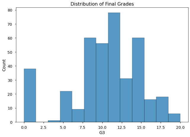
ax = sns.histplot(data=df,x='G3');
ax.set_title("Distribution of Final Grades")
Text(0.5, 1.0, 'Distribution of Final Grades')
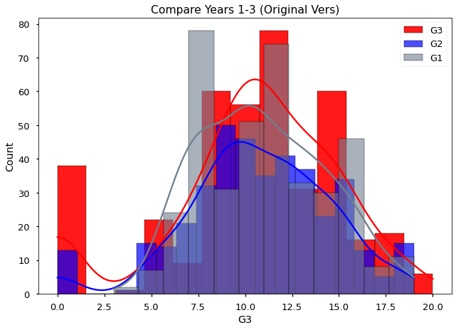
Lets compare all 3 years of grades on one histogram. Since each grade is a separate column, one approach we could take is to use the histplot function 3 times, once for each column.
## Use histplot 3 times
sns.histplot(data=df,x='G3',color='r',alpha=0.9,kde=True,label='G3');
sns.histplot(data=df,x='G2',color='b',alpha=0.7,kde=True,label='G2');
sns.histplot(data=df,x='G1',color='slategray',alpha=0.6,kde=True,label='G1');
plt.title('Compare Years 1-3 (Original Vers)')
plt.legend();
Another way we can leverage seaborn’s functionality is to make a new version of our dataframe where the columns “G1”-“G3” will be transposed so that we will have a 1 column with all of the grades and another column with the label for which year the grade was from.
## Let's turn the integer index into a col for student-id
df = df.reset_index()
df = df.rename({'index':'student'},axis=1)
df
| student | school | sex | age | address | famsize | Pstatus | Medu | Fedu | Mjob | ... | famrel | freetime | goout | Dalc | Walc | health | absences | G1 | G2 | G3 | |
|---|---|---|---|---|---|---|---|---|---|---|---|---|---|---|---|---|---|---|---|---|---|
| 0 | 0 | GP | F | 18.0 | U | GT3 | A | 4.0 | 4.0 | at_home | ... | 4.0 | 3.0 | 4.0 | 1.0 | 1.0 | 3.0 | 6.0 | 5.0 | 6.0 | 6.0 |
| 1 | 1 | GP | F | 17.0 | U | GT3 | T | 1.0 | 1.0 | at_home | ... | 5.0 | 3.0 | 3.0 | 1.0 | 1.0 | 3.0 | 4.0 | 5.0 | 5.0 | 6.0 |
| 2 | 2 | GP | F | 15.0 | U | LE3 | T | 1.0 | 1.0 | at_home | ... | 4.0 | 3.0 | 2.0 | 2.0 | 3.0 | 3.0 | 10.0 | 7.0 | 8.0 | 10.0 |
| 3 | 3 | GP | F | 15.0 | U | GT3 | T | 4.0 | 2.0 | health | ... | 3.0 | 2.0 | 2.0 | 1.0 | 1.0 | 5.0 | 2.0 | 15.0 | 14.0 | 15.0 |
| 4 | 4 | GP | F | 16.0 | U | GT3 | T | 3.0 | 3.0 | other | ... | 4.0 | 3.0 | 2.0 | 1.0 | 2.0 | 5.0 | 4.0 | 6.0 | 10.0 | 10.0 |
| ... | ... | ... | ... | ... | ... | ... | ... | ... | ... | ... | ... | ... | ... | ... | ... | ... | ... | ... | ... | ... | ... |
| 390 | 390 | MS | M | 20.0 | U | LE3 | A | 2.0 | 2.0 | services | ... | 5.0 | 5.0 | 4.0 | 4.0 | 5.0 | 4.0 | 11.0 | 9.0 | 9.0 | 9.0 |
| 391 | 391 | MS | M | 17.0 | U | LE3 | T | 3.0 | 1.0 | services | ... | 2.0 | 4.0 | 5.0 | 3.0 | 4.0 | 2.0 | 3.0 | 14.0 | 16.0 | 16.0 |
| 392 | 392 | MS | M | 21.0 | R | GT3 | T | 1.0 | 1.0 | other | ... | 5.0 | 5.0 | 3.0 | 3.0 | 3.0 | 3.0 | 3.0 | 10.0 | 8.0 | 7.0 |
| 393 | 393 | MS | M | 18.0 | R | LE3 | T | 3.0 | 2.0 | services | ... | 4.0 | 4.0 | 1.0 | 3.0 | 4.0 | 5.0 | 0.0 | 11.0 | 12.0 | 10.0 |
| 394 | 394 | MS | M | 19.0 | U | LE3 | T | 1.0 | 1.0 | other | ... | 3.0 | 2.0 | 3.0 | 3.0 | 3.0 | 5.0 | 5.0 | 8.0 | 9.0 | 9.0 |
395 rows × 34 columns
melted = pd.melt(df,id_vars='student', value_vars=['G1','G2','G3'],var_name='PrevYear',
                value_name="Grade")
melted
| student | PrevYear | Grade | |
|---|---|---|---|
| 0 | 0 | G1 | 5.0 |
| 1 | 1 | G1 | 5.0 |
| 2 | 2 | G1 | 7.0 |
| 3 | 3 | G1 | 15.0 |
| 4 | 4 | G1 | 6.0 |
| ... | ... | ... | ... |
| 1180 | 390 | G3 | 9.0 |
| 1181 | 391 | G3 | 16.0 |
| 1182 | 392 | G3 | 7.0 |
| 1183 | 393 | G3 | 10.0 |
| 1184 | 394 | G3 | 9.0 |
1185 rows × 3 columns
ax = sns.histplot(data=melted,hue='PrevYear', x='Grade',kde=True)
ax.set_title('Comparing Years 1-3 (Melted Vers)')
Text(0.5, 1.0, 'Comparing Years 1-3 (Melted Vers)')
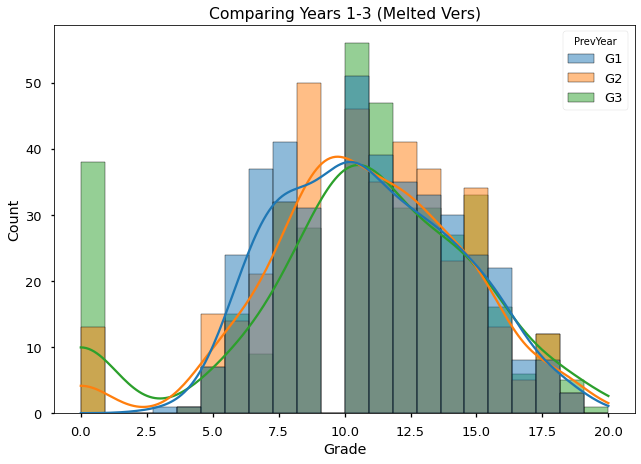
Visualizing all 3 grades at the same time, we can see there is actually a gap in the middle of the scores. It seems no student ever receives a grade around 10. This may be something to investigate further in the future.
It also looks like The # of students with scores near 0 increased each year.
Is there a better way we can see how students performance changed each year?
Visualizing Progress By Grade Groups#
Let’s define groups for each year’s scores by binning the scores.
df.describe()[['G1','G2','G3']]
| G1 | G2 | G3 | |
|---|---|---|---|
| count | 395.000000 | 395.000000 | 395.000000 |
| mean | 10.908861 | 10.713924 | 10.415190 |
| std | 3.319195 | 3.761505 | 4.581443 |
| min | 3.000000 | 0.000000 | 0.000000 |
| 25% | 8.000000 | 9.000000 | 8.000000 |
| 50% | 11.000000 | 11.000000 | 11.000000 |
| 75% | 13.000000 | 13.000000 | 14.000000 |
| max | 19.000000 | 19.000000 | 20.000000 |
## defining bins and their labels
bins = [0,8,14,20]

bin_labels = ['1. low','2. med','3. high']
## Visualizing bin cutoffs
ax = sns.histplot(data=melted,hue='PrevYear', x='Grade',kde=True)
ax.set_title('Comparing Years 1-3 (Melted Vers)')
ax.axvspan(bins[0],bins[1],zorder=0,color='lightcoral',label='Low',alpha=0.6)
ax.axvspan(bins[1],bins[2],zorder=0,color='skyblue', label='Med',alpha=0.6)
ax.axvspan(bins[2],bins[3],zorder=0,color='limegreen', label='High',alpha=0.6)
ax.set_xlim(left=0,right=20)
(0.0, 20.0)
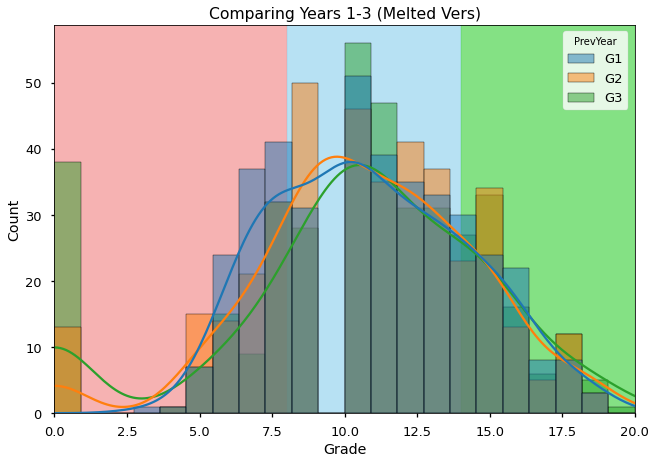
ADD A BRIEF EXPLANATION
pd.cut(df['G1'], bins,right=False,include_lowest=True)#,labels=bin_labels)
0        [0, 8)
1        [0, 8)
2        [0, 8)
3      [14, 20)
4        [0, 8)
         ...
390     [8, 14)
391    [14, 20)
392     [8, 14)
393     [8, 14)
394     [8, 14)
Name: G1, Length: 395, dtype: category
Categories (3, interval[int64, left]): [[0, 8) < [8, 14) < [14, 20)]
bins
[0, 8, 14, 20]
df['First-Year Group'] = pd.cut(df['G1'],bins,labels=bin_labels, right=True,include_lowest=True)
df['Final-Year Group'] = pd.cut(df['G3'],bins,labels=bin_labels,right=True,include_lowest=True)
df
| student | school | sex | age | address | famsize | Pstatus | Medu | Fedu | Mjob | ... | goout | Dalc | Walc | health | absences | G1 | G2 | G3 | First-Year Group | Final-Year Group | |
|---|---|---|---|---|---|---|---|---|---|---|---|---|---|---|---|---|---|---|---|---|---|
| 0 | 0 | GP | F | 18.0 | U | GT3 | A | 4.0 | 4.0 | at_home | ... | 4.0 | 1.0 | 1.0 | 3.0 | 6.0 | 5.0 | 6.0 | 6.0 | 1. low | 1. low |
| 1 | 1 | GP | F | 17.0 | U | GT3 | T | 1.0 | 1.0 | at_home | ... | 3.0 | 1.0 | 1.0 | 3.0 | 4.0 | 5.0 | 5.0 | 6.0 | 1. low | 1. low |
| 2 | 2 | GP | F | 15.0 | U | LE3 | T | 1.0 | 1.0 | at_home | ... | 2.0 | 2.0 | 3.0 | 3.0 | 10.0 | 7.0 | 8.0 | 10.0 | 1. low | 2. med |
| 3 | 3 | GP | F | 15.0 | U | GT3 | T | 4.0 | 2.0 | health | ... | 2.0 | 1.0 | 1.0 | 5.0 | 2.0 | 15.0 | 14.0 | 15.0 | 3. high | 3. high |
| 4 | 4 | GP | F | 16.0 | U | GT3 | T | 3.0 | 3.0 | other | ... | 2.0 | 1.0 | 2.0 | 5.0 | 4.0 | 6.0 | 10.0 | 10.0 | 1. low | 2. med |
| ... | ... | ... | ... | ... | ... | ... | ... | ... | ... | ... | ... | ... | ... | ... | ... | ... | ... | ... | ... | ... | ... |
| 390 | 390 | MS | M | 20.0 | U | LE3 | A | 2.0 | 2.0 | services | ... | 4.0 | 4.0 | 5.0 | 4.0 | 11.0 | 9.0 | 9.0 | 9.0 | 2. med | 2. med |
| 391 | 391 | MS | M | 17.0 | U | LE3 | T | 3.0 | 1.0 | services | ... | 5.0 | 3.0 | 4.0 | 2.0 | 3.0 | 14.0 | 16.0 | 16.0 | 2. med | 3. high |
| 392 | 392 | MS | M | 21.0 | R | GT3 | T | 1.0 | 1.0 | other | ... | 3.0 | 3.0 | 3.0 | 3.0 | 3.0 | 10.0 | 8.0 | 7.0 | 2. med | 1. low |
| 393 | 393 | MS | M | 18.0 | R | LE3 | T | 3.0 | 2.0 | services | ... | 1.0 | 3.0 | 4.0 | 5.0 | 0.0 | 11.0 | 12.0 | 10.0 | 2. med | 2. med |
| 394 | 394 | MS | M | 19.0 | U | LE3 | T | 1.0 | 1.0 | other | ... | 3.0 | 3.0 | 3.0 | 5.0 | 5.0 | 8.0 | 9.0 | 9.0 | 1. low | 2. med |
395 rows × 36 columns
df[df['Final-Year Group'].isna()]
| student | school | sex | age | address | famsize | Pstatus | Medu | Fedu | Mjob | ... | goout | Dalc | Walc | health | absences | G1 | G2 | G3 | First-Year Group | Final-Year Group |
|---|
0 rows × 36 columns
df['Final-Year Group'].value_counts(dropna=False)
2. med     220
1. low     102
3. high     73
Name: Final-Year Group, dtype: int64
melted = pd.melt(df,id_vars=['student','First-Year Group','Final-Year Group'],
                 value_vars=['G1','G2','G3'],var_name='PrevYear',
                value_name="Grade")
melted
| student | First-Year Group | Final-Year Group | PrevYear | Grade | |
|---|---|---|---|---|---|
| 0 | 0 | 1. low | 1. low | G1 | 5.0 |
| 1 | 1 | 1. low | 1. low | G1 | 5.0 |
| 2 | 2 | 1. low | 2. med | G1 | 7.0 |
| 3 | 3 | 3. high | 3. high | G1 | 15.0 |
| 4 | 4 | 1. low | 2. med | G1 | 6.0 |
| ... | ... | ... | ... | ... | ... |
| 1180 | 390 | 2. med | 2. med | G3 | 9.0 |
| 1181 | 391 | 2. med | 3. high | G3 | 16.0 |
| 1182 | 392 | 2. med | 1. low | G3 | 7.0 |
| 1183 | 393 | 2. med | 2. med | G3 | 10.0 |
| 1184 | 394 | 1. low | 2. med | G3 | 9.0 |
1185 rows × 5 columns
bins_info = [('1. low',{ 'bins':(bins[0],bins[1]),
                    'line_color':'darkred','span_color': 'lightcoral'}),
             ('2. med',{ 'bins':(bins[1],bins[2]),
                    'line_color':'blue','span_color':'skyblue'}),
              ('3. high',{ 'bins':(bins[2],bins[3]),
                      'line_color':'forestgreen','span_color':'limegreen'})
            ]
bins_info
[('1. low',
  {'bins': (0, 8), 'line_color': 'darkred', 'span_color': 'lightcoral'}),
 ('2. med', {'bins': (8, 14), 'line_color': 'blue', 'span_color': 'skyblue'}),
 ('3. high',
  {'bins': (14, 20), 'line_color': 'forestgreen', 'span_color': 'limegreen'})]
## slice out list of line colors
line_colors = [v[1]['line_color'] for v in bins_info]
line_colors
['darkred', 'blue', 'forestgreen']
## Plot visual using Final year Groups for colors
ax = pd.plotting.parallel_coordinates(df,'Final-Year Group',cols=['G1','G2','G3'],
                                 color= line_colors,sort_labels=False,alpha=0.5)
ax.set_title("Year 1-3 grades - Colored by Final Grade Groups");

## Annotate
for group, grp_dict in bins_info:
    ax.axhspan(grp_dict['bins'][0],grp_dict['bins'][1],
               color=grp_dict['span_color'], alpha=0.5, label=group)

ax.set_ylim(bottom=0,top=20)
(0.0, 20.0)
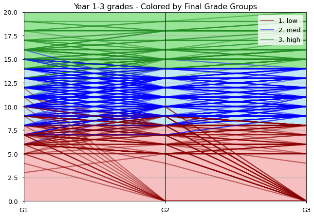
Looking at our parallel coordinates plot - grouped by Final Grades, we can see that there are students who were in the low group for G3 that had been in the med-group range. So students whose performance dropped from average to below average over the years.
We can also see that there were some students in the high group whose G1 scores were in the med range, showing that they improved their performance over years 1-3.
We also notice that there are a lot of zeroes that appear in G2 and G3, what we can see all that lines that were 0 for G2 stayed at 0 for G3.
Next Steps#
Now that we have an idea of the target we are analyzing, we are ready to move onto modeling!
We will start by exploring answering our stakeholder’s question(s) with regression modeling.
Let’s get started!
APPENDIX#
raise Exception("stop here")
---------------------------------------------------------------------------
Exception                                 Traceback (most recent call last)
Input In [24], in <cell line: 1>()
----> 1 raise Exception("stop here")

Exception: stop here
## exaple from https://pandas.pydata.org/docs/reference/api/pandas.plotting.parallel_coordinates.html
## want a version for g1-g3
df2 = pd.read_csv(
    'https://raw.github.com/pandas-dev/'
    'pandas/main/pandas/tests/io/data/csv/iris.csv'
)
df2
pd.plotting.parallel_coordinates(df2, 'Name')

